Modifying Hugo layout
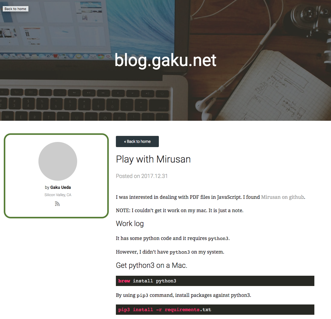
I don’t quite like the layout. The left-side panel is taking too much space to me.

The basic structure of the page was like this:
- Make the author column very narrow.
- Move the author column to the right.
I’ve switched it to use flexbox layout.
I’ve edited themes/hugo-minimalist-theme/static/css/styles.css.
.container {
    display: flex;
}
.author {
    flex-grow: 0;
    margin-right: 40px;
    margin-left: 20px;
}
.content {
    flex-grow: 1;
    margin-left: 40px;
    margin-right: 20px;
}
It is not quite there yet, but I like it better than the original.
Improvement
I put more whitespace by making it a three-column layout. Both sides take up 10% each and the main content takes up the rest. You can specify percentage to flex.
<div class="container">
  <div class="leftnav"></div>
  <main class="content"></main>
  <author class="author"></author>
</div>
and
.container {
    display: flex;
}
.leftnav {
    flex: 0 0 10%;
}
.content {
    flex-grow: 1;
    margin-left: 40px;
    margin-right: 20px;
}
.author {
    flex: 0 0 10%;
    margin-right: 40px;
    margin-left: 20px;
}
Code snippet
The original style took up too much space. I’ve changed the font to Roboto Mono from Google font.
samp {
  font-family: 'Roboto Mono',  monospace, monospace;
  font-size: 12px;
  background-color: #f8f8f8;
}
    <head>
        ...
        <link href="https://fonts.googleapis.com/css?family=Roboto+Mono" rel="stylesheet">
        ...
    </head>
